


Project: YUMMY Food Truck
PROJECT BACKGROUND
YUMMY is a food truck based in the Netherlands. They rotate between different locations in the centre of Amsterdams but also cover special events.
YUMMY chefs love to travel! Therefore, they strive to deliver healthy, special dishes inspired by places they have visited. YUMMY offers a wide spectrum of competitive pricing. They target customers like tourists, commuters but also locals who love to experiment with different dishes.
The problem
Tourists and locals alike are enthusiastic about food trucks, but they are often frustrated by the lack of information on the ingredients of dishes.
The ordering process can be overwhelming due to language barriers and long waiting lines.
The goal
Design an app for YUMMY Food Truck that allows users to easily browse through dishes and find ingredients information, so they can order and pick up fresh, healthy food that fits with their dietary requirements.
My role & responsibilities
UX designer / Project lead, designing an app for YUMMY Food Truck from conception to delivery. I was in charge of:
- Conducting interviews
- Paper and digital wireframing
- Low and high-fidelity prototyping
- Conducting usability studies
- Accounting for accessibility and iterating on designs.
/* MENU */
UNDERSTANDING THE USER
To kick off this project, I wanted to understand common challenges people face when ordering street food, especially from places they have never tried before. Therefore, I run a survey with online respondents (n=15). Subsequently, I invited a few respondents for an interview in order to understand how they feel about ordering from food trucks (n=5).
Based on these insights I created empathy maps to understand the users I am
designing for and their needs. A primary user group identified through research
was young adults tourists who are curious about trying new food as part of their travel experience.
This user group confirmed initial assumptions about YUMMY’s customers; additionally, the research revealed that locals are also interested in consuming food from food trucks on a regular basis.
Other user problems identified included long waiting lines, food allergies, or insecurity about approaching the chefs in another language.
User research: pain points
CLARITY ABOUT INGREDIENTS
Users would like to know the ingredients that go in a dish to see if it fits their diet.
LONG WAITING TIMES
Users would like to place an order in advance so they do not need to wait in line.
AVAILABILITY OF DISHES
Users mention a common frustration of paper menus not being updated in time, so often dishes that are mentioned are not available when they decide to order.
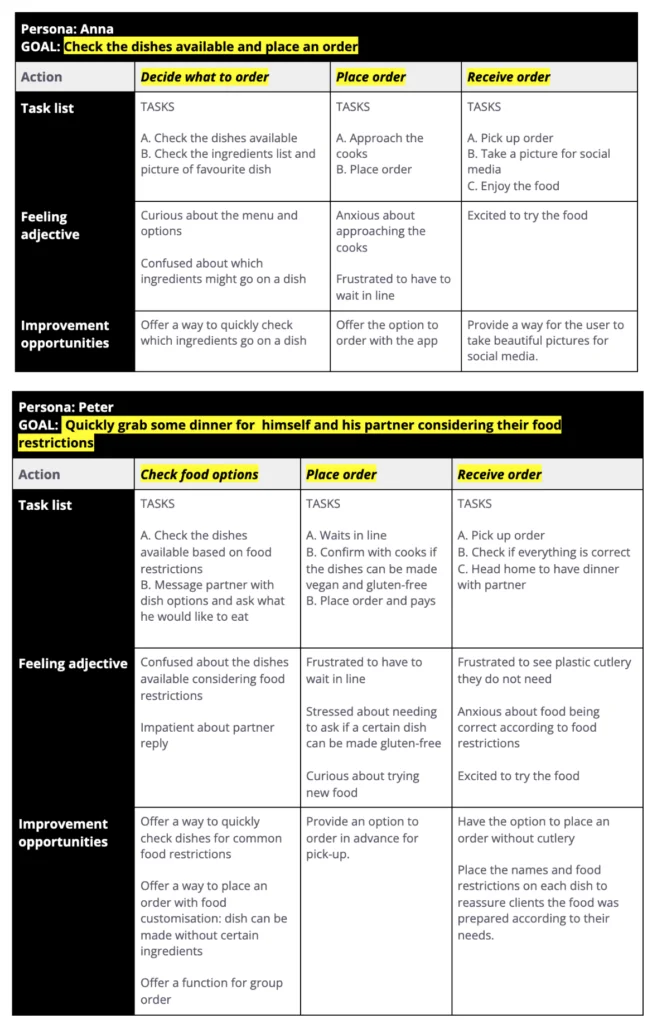
Personas & their journeys
Based on the insights collected in the initial research, I drafted two personas and their corresponding user stories and problem statements.
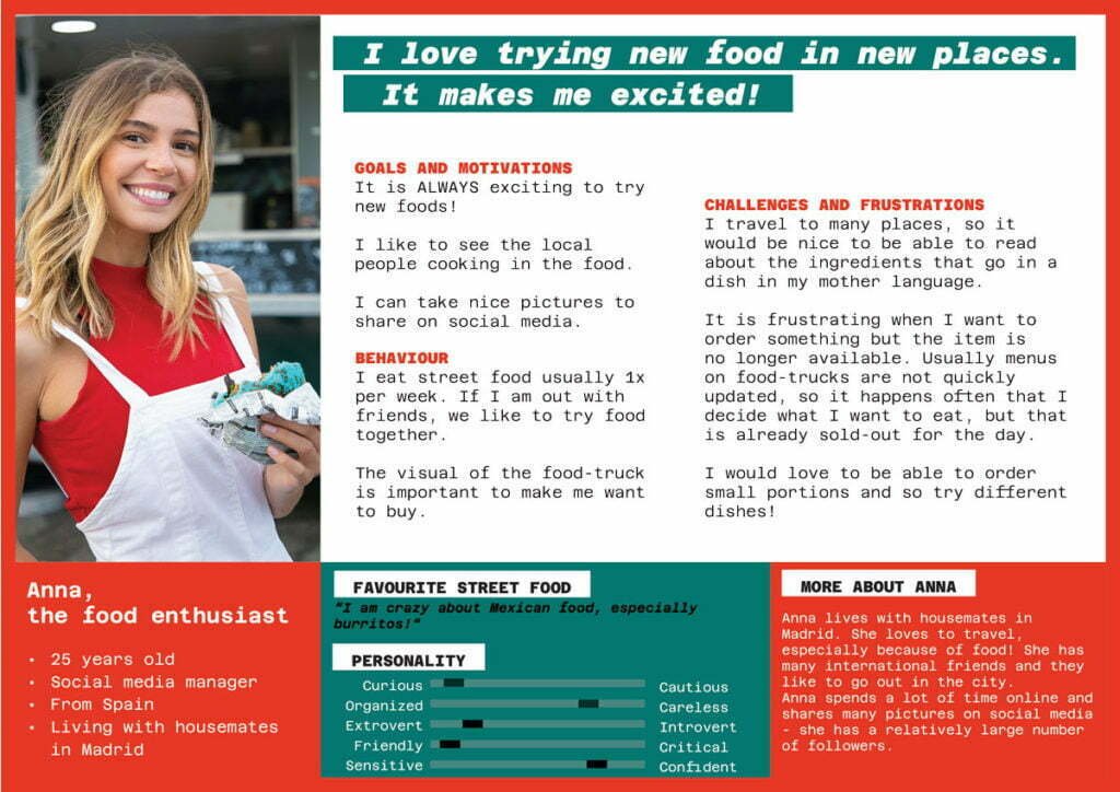
USER STORY
As a young traveller who likes to try new food
I want to see all the food options currently available with indications of ingredients and portion sizes
so that I can plan my order at my own peace.
PROBLEM STATEMENT
Anna is a young traveller food enthusiast who needs an efficient and information-rich way to browse through a menu because street food menus are not always updated and they lack clarity on what she can expect from a dish.
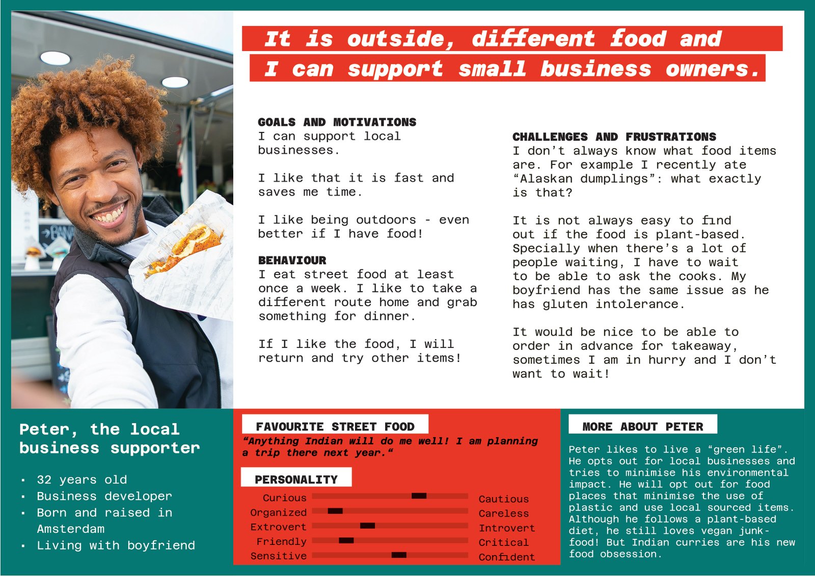
USER STORY
As a person who recently started following a plant-based diet
I want to have clarity about the dishes I can order based on the diet I follow
so that I can better compare the food options available for me and pick the one I want.
As a young professional who likes to support local businesses
I want to be able to place orders in advance at my favourite food truck
so that I can save time in the line and also save time cooking.
PROBLEM STATEMENT
Peter is a local young professional who needs a reliable way to check the ingredients in a dish because he often orders food for people with food restrictions.
By mapping the user journey for the personas Anna and Peter it is revealed that the possibility to place orders with an app can help to reduce anxiety and confusion around ingredients in a dish as well as reduce waiting time in line.
STARTING THE DESIGN
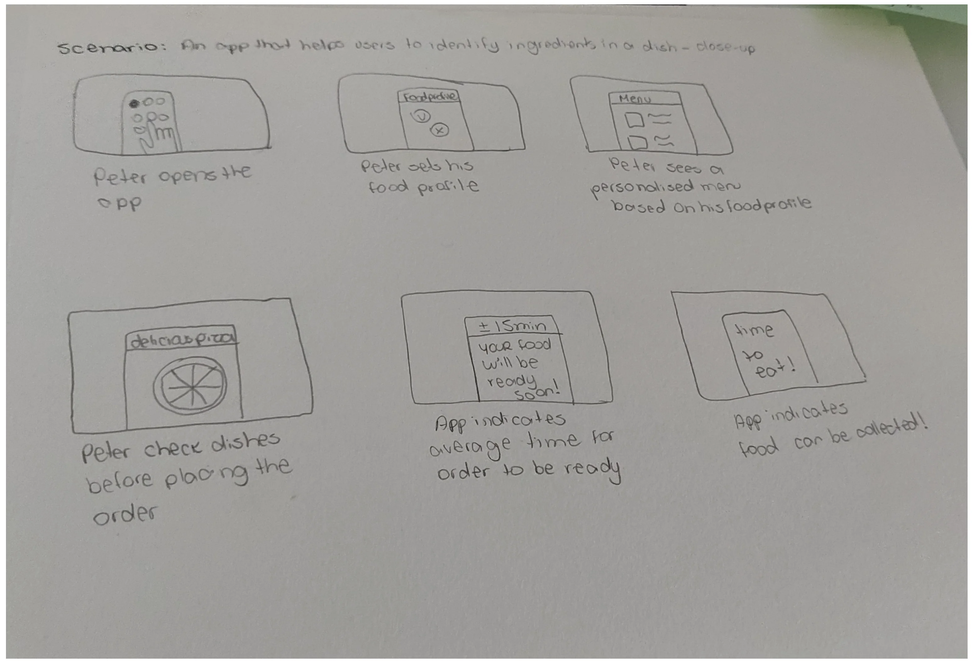
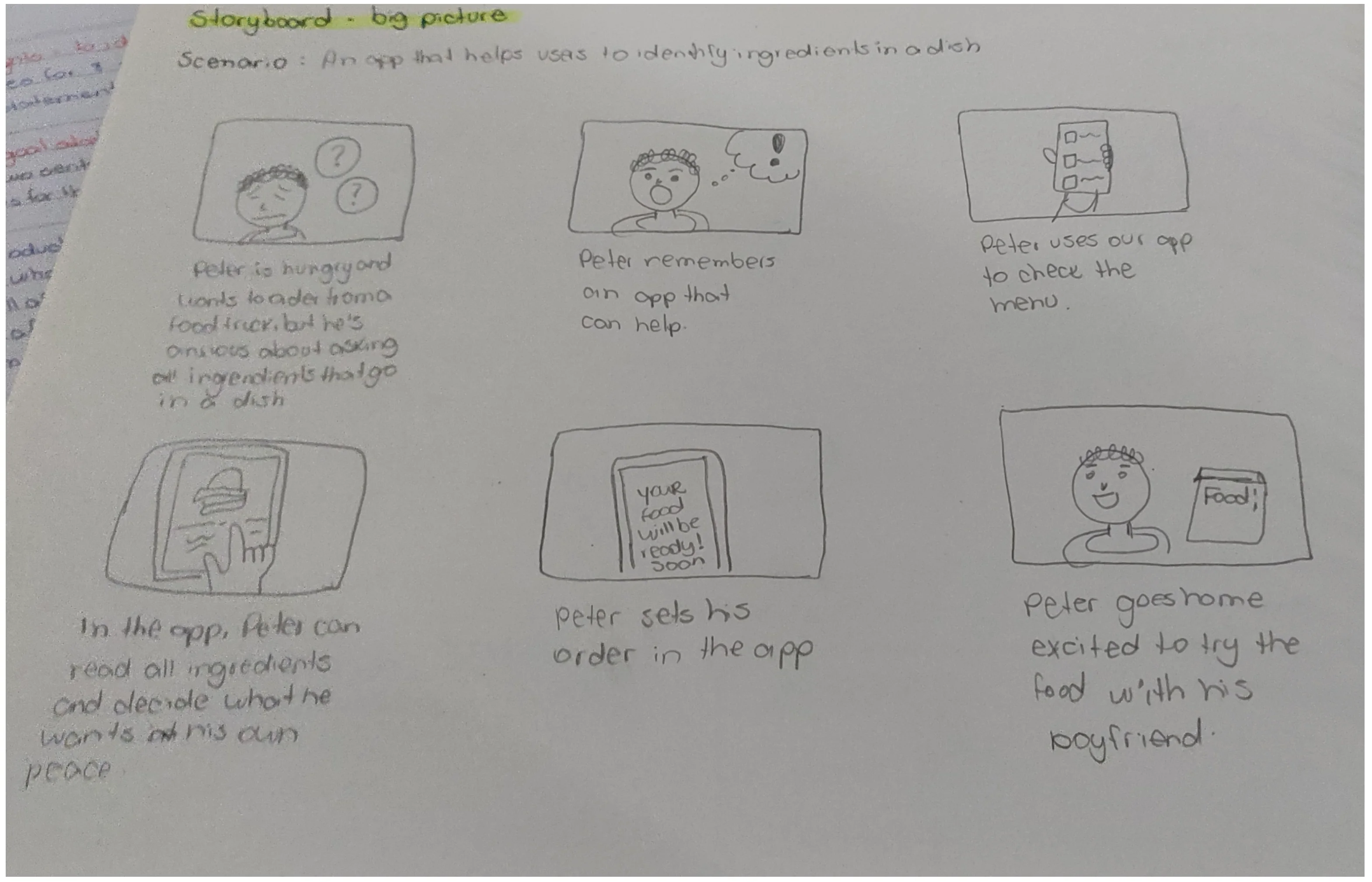
Time for some paper work!
Taking the time to draft iterations of each screen of the app on paper ensured that the elements that made it to digital wireframes would be well-suited to address user pain points.

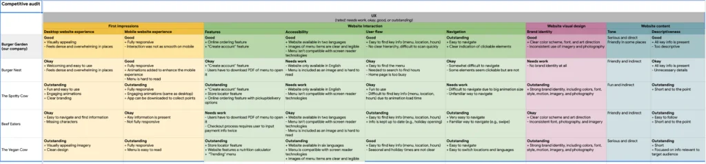
Competitor analysis
The goal of the competitor analysis was to compare the menu and ordering experience of five direct and indirect competitors of YUMMY Food Truck. At the end of the audit, I summarised competitors strengths, weaknesses, gaps and design opportunities.
From paper to digital wireframes
As the initial design phase continued, I made sure to base the first screen designs on feedback and findings from the user research and competitor analysis.
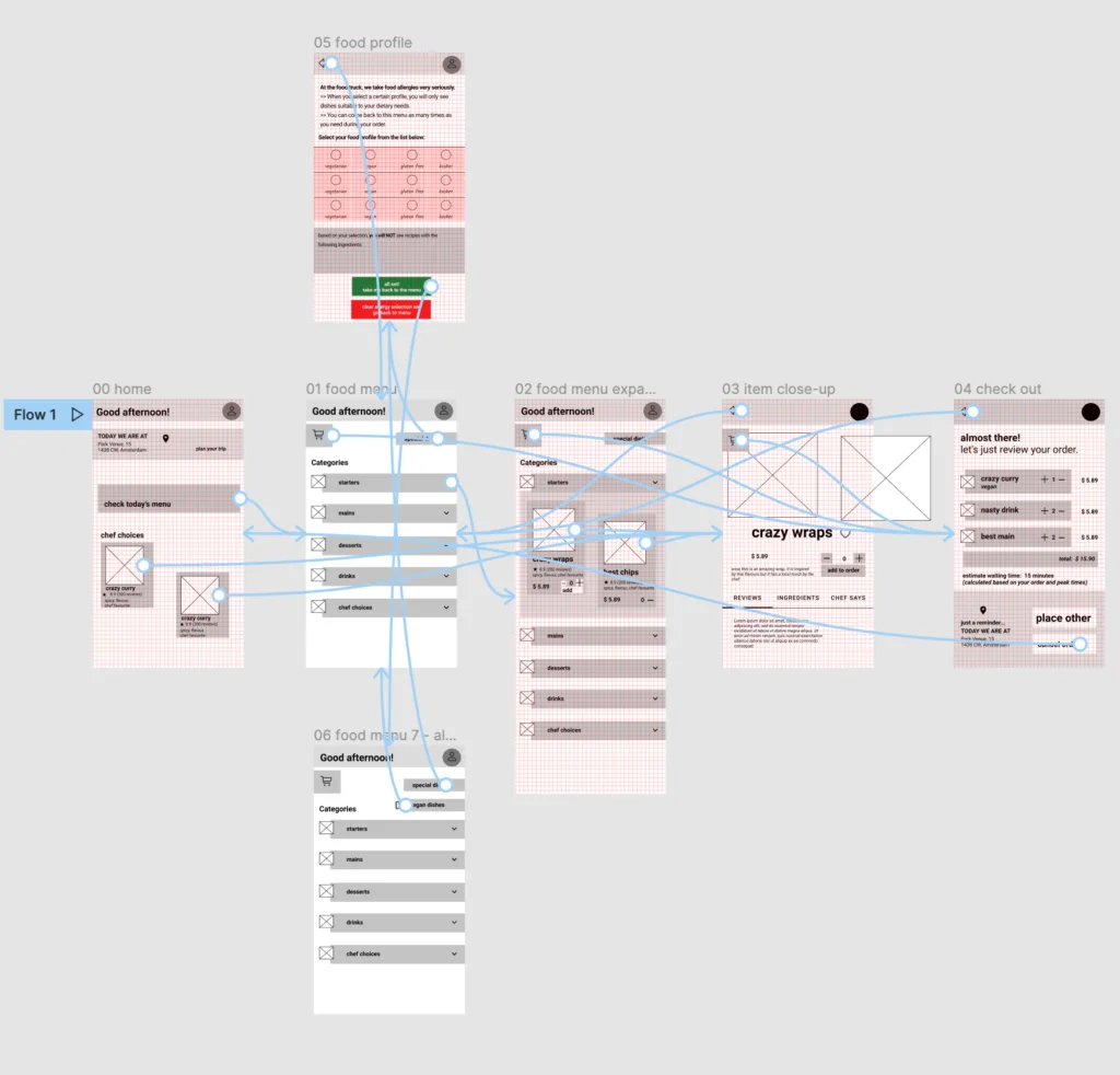
Low-fi prototype
Using the completed set of digital wireframes, I created the low-fidelity prototype. The primary user flow I connected was ordering a dish after checking the dish page. A secondary flow considering diet restrictions has also been implemented in this prototype.
The usability study investigated both flows, so as to determine essential aspects for the development of a MVP.
REFINING THE DESIGN
Usability tests: findings
I conducted two rounds of usability studies. Both studies were unmoderated and participants (n=10) received three prompts. Findings from the first study helped guide the designs from wireframes to mockups. The second study used a high-fidelity prototype and revealed what aspects of the mockups needed refining.
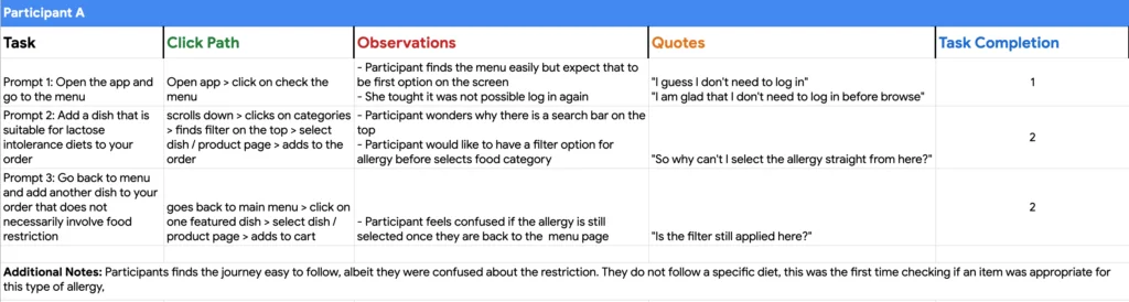
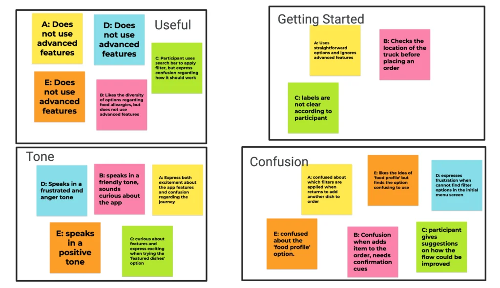
ROUND 1 FINDINGS
- Users want simple and straightforward filter options;
- Users need more feedback during their journey;
- Users should be reminded of the location of the truck before placing an order.
ROUND 2 FINDINGS
- Users are satisfied when they can read ingredients in a dish; a function for “food profile” could be implemented in a later version of the app, but current flow is confusing;
- Users would like to see recommendations of dishes by chefs and / or reviews from other users.
Applying the insights to the designs
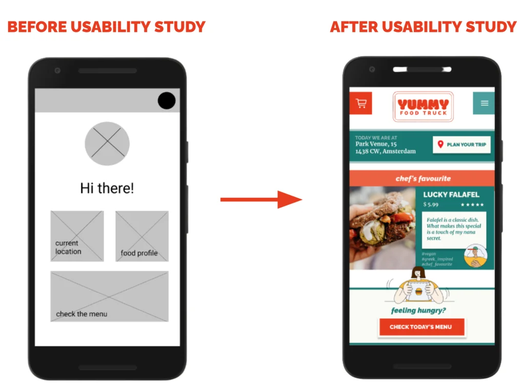
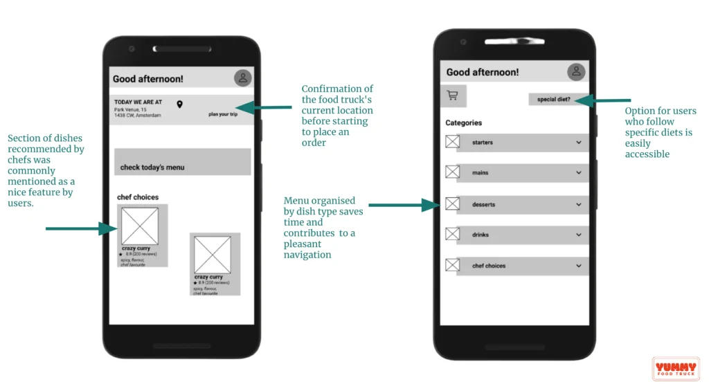
It is essential that users know the current food truck location to place an order. Early designs allowed for users to check this information, but after the usability studies, I made this information prominent on the initial screen before users start their journey. I also revised the design so users see suggestions of dishes when they first land on the app.
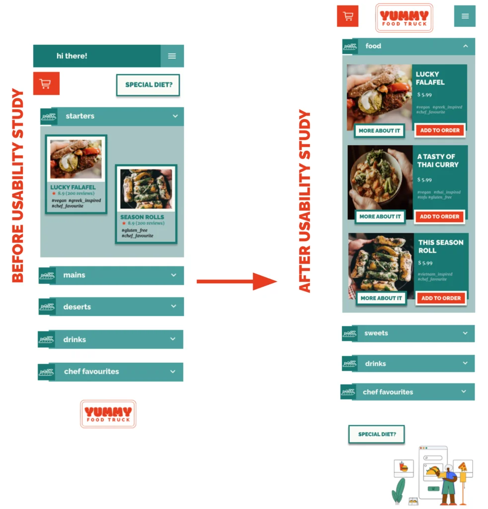
The second usability study shed light on improvements that could be applied to the menu, such as enhancing the design with visual cues and placing a button that allows users to add a dish to their order from this screen. Additionally, the design was revised to give more focus on real pictures of the dishes.
High-fidelity prototype
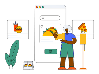
The final high-fidelity prototype presented a cleaner user flow for visualising items in the menu and placing an order. It also meets user needs for giving transparency on the ingredients that are present in a dish.
GOING FORWARD
Impact
The app makes users feel like YUMMY Food Truck truly cares about their clients, establishing trust.
“This is a fun way to check what’s on the menu for the day. I like it gives me detailed information about the dishes, like the ingredients and comments from the chefs.”
Quote from peer-feedback
What I learned
Less is more and simplicity is beautiful!
As designers, we have many ideas for fancy functionalities, but users will be satisfied with simple solutions that solve their problems. There is always room to improve a product, but it is important to move forward even when things are not (yet!) perfect.

Special thanks to the illustration designer Susana Salas.
Next steps
- Conduct further user research on specifics of implementing a function for ‘food profile’;
- Conduct another round of usability studies to validate whether the pain points users experienced have been effectively addressed;
- Conduct more user research to determine any new areas of need.
- NOTE: The purpose of this project was to deliberately deliver a mobile app. However, in the context of food trucks and catering for tourists / passbyers, I would recommend the client to develop a mobile webpage, so as to remove the need to download an app.