Project: Miauw Miauw
project background
Miauw Miauw is a cat supply store that allows users to schedule boxes with items for their pets, similarly to businesses that operate in a subscription model. The business targets users who prefer to order items for their pets online because of the convenience of saving time and money, while finding everything they need at the same place.
The problem
There are many subscription services for pets online, so how can Miauw Miauw be of value to cat owners? In this five-week-long project as part of the Google Professional UX Certificate, you can follow the design thinking process I apply when developing new websites.
The goal
Design a responsive website for a subscription service of a cat delivery box, focusing on the order tracking flow.
My role & responsibilities
In this mockup project, I worked both as the lead UX researcher and the concept developer. My activities included:
- Conducting interviews
- Paper and digital wireframing
- Low and high-fidelity prototyping
- Conducting usability studies
- Accounting for accessibility and iterating on designs.
/* MENU */

It always start with research
Upon receiving the prompt, I performed first and second research to understand the reasons why people opt to order cat supplies online, as well as their main pain points related to tracking online orders.
Research goals
Understand the motivations, challenges and frustrations of cat owners when ordering food online, especially when they are tied to a subscription service.
What are some user experience killers when ordering from online stores?
What makes ordering items for your pet online a good experience?
Research methodology
For this initial phase, a total of 25 data points were collected from first-hand research. I combined answers from a survey (n=20) and semi-structured interviews (n=5) with second-hand research performed in online forums. I was interested in collecting an extensive list of what frustrates consumers in online shopping. With these insights, I moved on to devising personas and empath maps.
Research insights
Based on these insights I created empathy maps to understand the users I am designing for and their needs. The primary user group identified through research was busy young adults who order everything online and are often frustrated with the delivery options. This user group confirmed initial assumptions about Miauw Miauw’s customers. However, the research revealed that older people are also interested in ordering their cat items online.
Other user problems identified included:
- Lack of tailoring of subscription plans (especially when caring for animals with special dietary needs);
- Flexibility of delivery options and rescheduling;
- Management of cat food in stock.
Visualising who I am desigining for
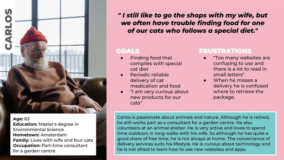
At this stage, it is important to have a visual representation of the users I am designing for. Drafting personas is crucial to start designing a solution in the right direction, but it also makes it easier to scale the project later on, especially when new colleagues join for new design challenges.

User stories & journeys
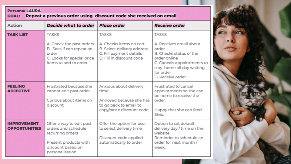
By mapping the user journey for the personas Laura and Carlos it is clear that a flexible subscription plan for cat items with personalised delivery options can help users to save time and money while offering greater convenience for pet owners.

Problem Statement
Laura is a young busy professional who lives with a cat who needs to be able to order all her cat supplies online in a reliable manner because she wants to save time and money and sometimes she forgets to buy cat food on time.
Carlos is a person who cares for four cats with different dietary requirements who needs to schedule orders for his pets based on their specific needs because he wants to offer nutritious meals to his cats that often cannot be found at stores while better managing his storage of pet items.
Hypothesis statement
If Laura uses the Miauw Miauw subscription service to order all the supplies her cat needs then she will save money on discounts, save time with personalised delivery options and she will never run out of cat food again.
If Carlos uses the Miauw Miauw subscription service to schedule food and medications for his cats then he will be able to offer nutritious meals to his cats tailored to their needs and better manage his stock of pet items.

EXPLORING DESIGN OPTIONS
Ideation
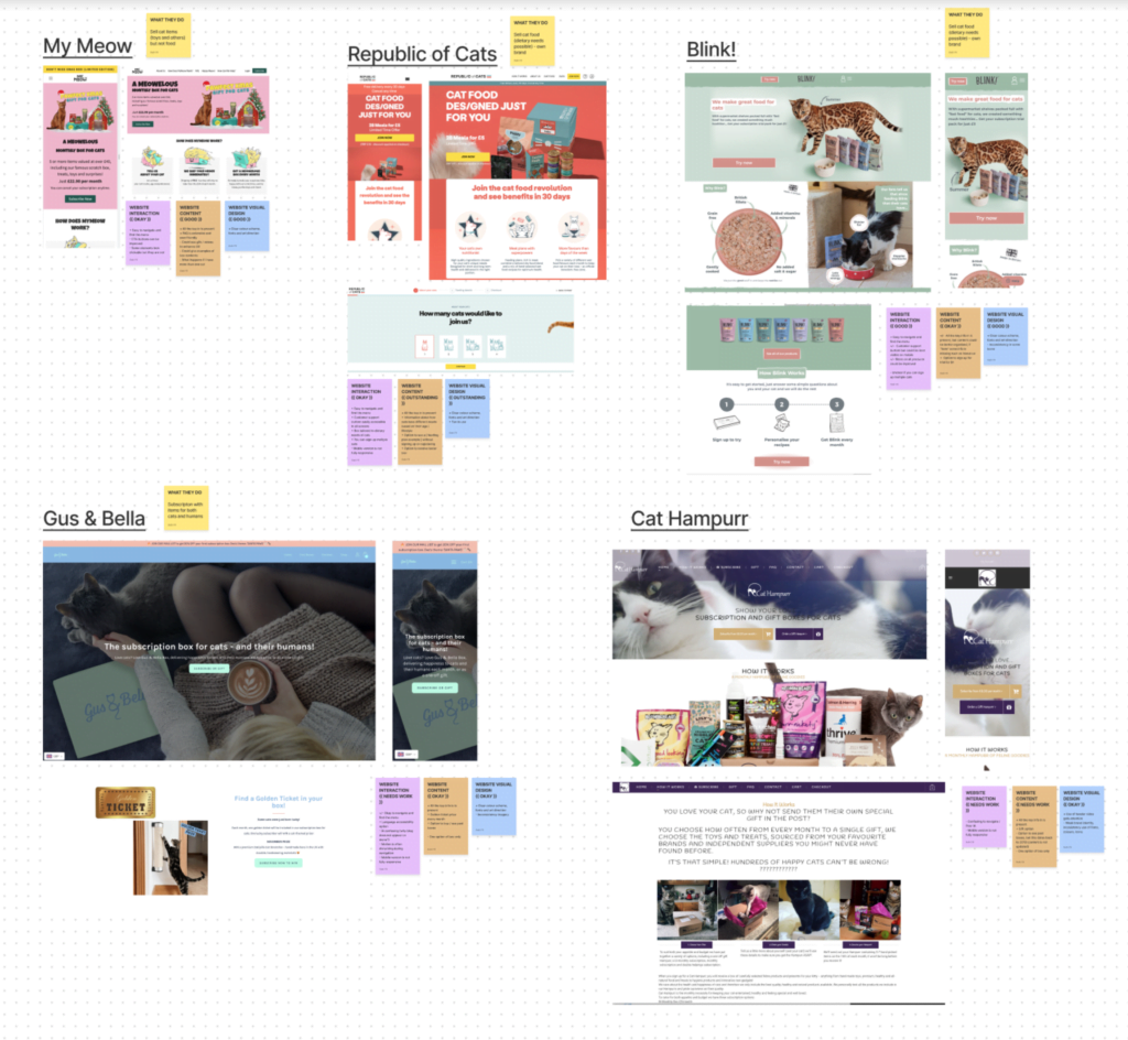
Kicking off the ideation step of the design process, I started by looking at the user statements and wondering about possible solutions that would fit with the user pain points. After identifying the key characteristics of a design solution, I moved on to a competitor analysis.

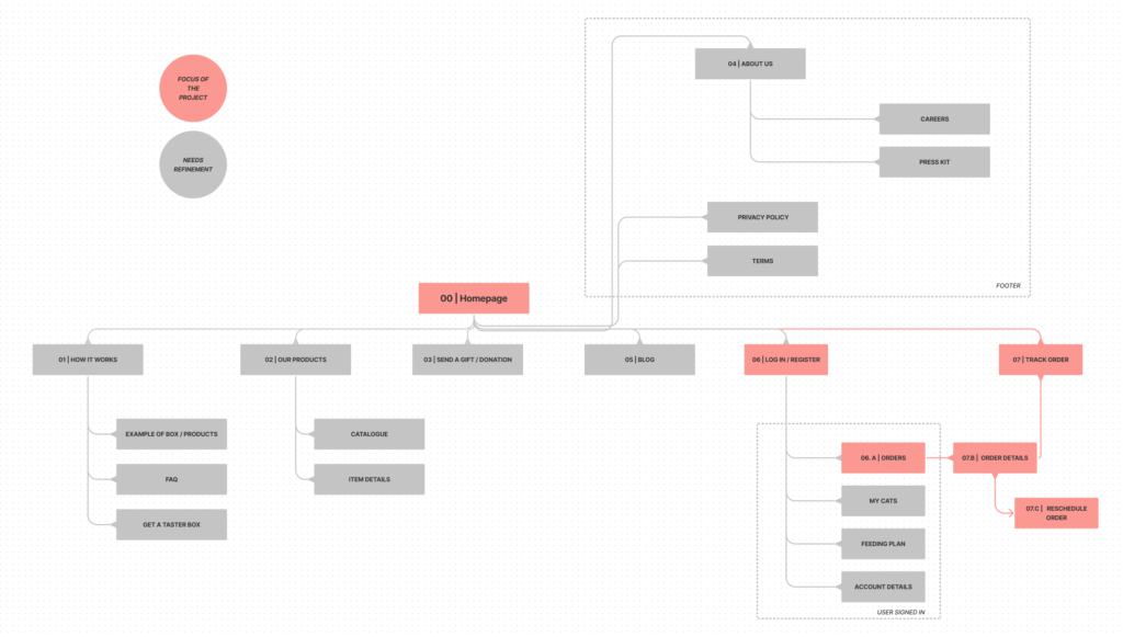
Next, I considered the information architecture for the whole website, drafting the sitemap. My goal here was to make strategic information architecture decisions that would improve overall website navigation.
I created a draft of the sitemap considering the main user needs that were identified with the initial research. A mixed-structure is likely to be more appropriate to fit the needs of this project, keeping in the mind the “3-click rule” for website navigation.
While this is not the final version of the sitemap, it represents where the tracking function fits within the schema, which is the main point of this project. Additionally, reference numbers are added to the schema in order to better manage the project and facilitate scalability.
Considering the scope of the project, which is about designing the delivery track flow, I moved forwarded with the “Crazy 8s” method for the initial draft of functionalities related to this journey. I also created user stories (both big picture and close-up) ideating on how users would interact with the product and potential emotional engagement.
At this point, I decided that the structure and design for the website pages should make the navigation fun, easy and simple. The final designs would include both illustrations of cats and gifs of “cat memes” in key steps of the user journey. Afterwards, don’t we all love a cat meme?

Design
Next, I sketch out paper wireframes for each screen in the user flow, keeping in mind the user pain points about navigation, browsing and functionality.
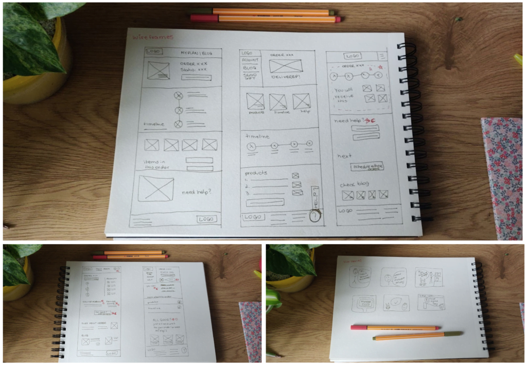
Moving from paper to digital wireframes made it easy to understand how the design could help address user pain points and improve the user experience of tracking a delivery. Prioritising useful button locations and visual element placements on the home page was a key part of my strategy.
Using the completed set of digital wireframes, I created a low-fidelity prototype. The flow follows the purpose of the assignment, which is tracking an order. The option to reschedule an order is also present in this prototype.

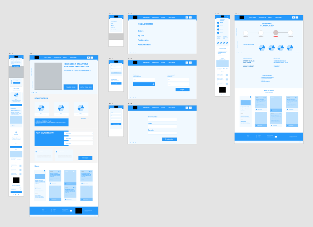
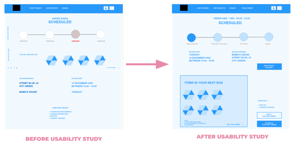
At this point, I run the first usability study with five users. Based on their feedback I improved elements such as the placement of buttons and page organisation, creating a more pleasant experience. It was now time to move to the mockups and create a high-fidelity prototype for another round of tests.

Test & Iterate: Usability studies
Usability studies are one of my favourite parts of the design process. ♥️ I love seeing how people interact with technology and thinking of how the experience could be improved.
For this project, I conducted two rounds of usability tests. Findings from the first study helped guide the designs from wireframes to mockups. The second study was based on a high-fidelity prototype and revealed which aspects of the mockups needed refining.
Both tests were unmoderated (n=10). Participants had 5 to 10 minutes to perform two prompts (track an order and reschedule the delivery date).
Research goals: Determine if users can complete core tasks related to tracking an order within the prototype of Miauw Miauw. Determine if the website is difficult to use.
Key performance indicators: Time on task; Conversion rate.
“I don’t know why I have to put extra details to know where my package is! “
Participant

Based on the insights from the usability studies, I made changes to improve website elements, especially on the page that covers the detailed tracking and information of an order. Important buttons were made more prominent, as well as crucial information. I also added the option to reschedule the delivery date on this page, simplifying the user flow. The second usability study using the high-fidelity prototype revealed that some users had problems with the colour contrast of the design, which was used as an insight for improvement.

TO THE FUTURE & BEYOND!
Miauw Miauw’s Cat Supply Store is as passionate about cats as the users who land on their website. ???? User needs impact business decisions in terms of the types of features that should be offered, which is reflected in the website design.
The next steps for this project would be performing further usability tests on the mobile and desktop versions of the website. Naturally, additional journeys need to be explored and designed for a MVP.
Next steps
- Conduct further user research on specifics of tracking and rescheduling an order. Are there other user pain points that could be addressed with both business and design implementations?
- Conduct another round of usability test with a more diverse group to validate whether the pain points users experienced have been effectively addressed. The usability test should also be conducted in different screen sizes.
- Conduct additional user research to determine any new areas of need, while continuing the development of additional flows.
What I learned
One size does not fit all!
There are many subscription boxes in the market, but there is still room for improvement in both business models and UX design.
Moreover, don’t be afraid of speaking the language of your users. The use of gifs and cat memes was appreciated by users who tested the prototype as they are part of their cat world.

LAST WORDS…

This project was developed in memory of Mimzi.
The best home office colleague I could ever ask.
I miss you every day ❤️
